Essencelle Web Design
- Final Design
- First Round
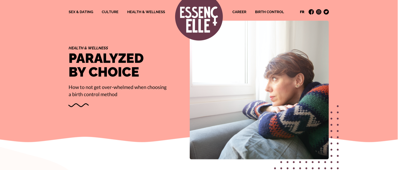
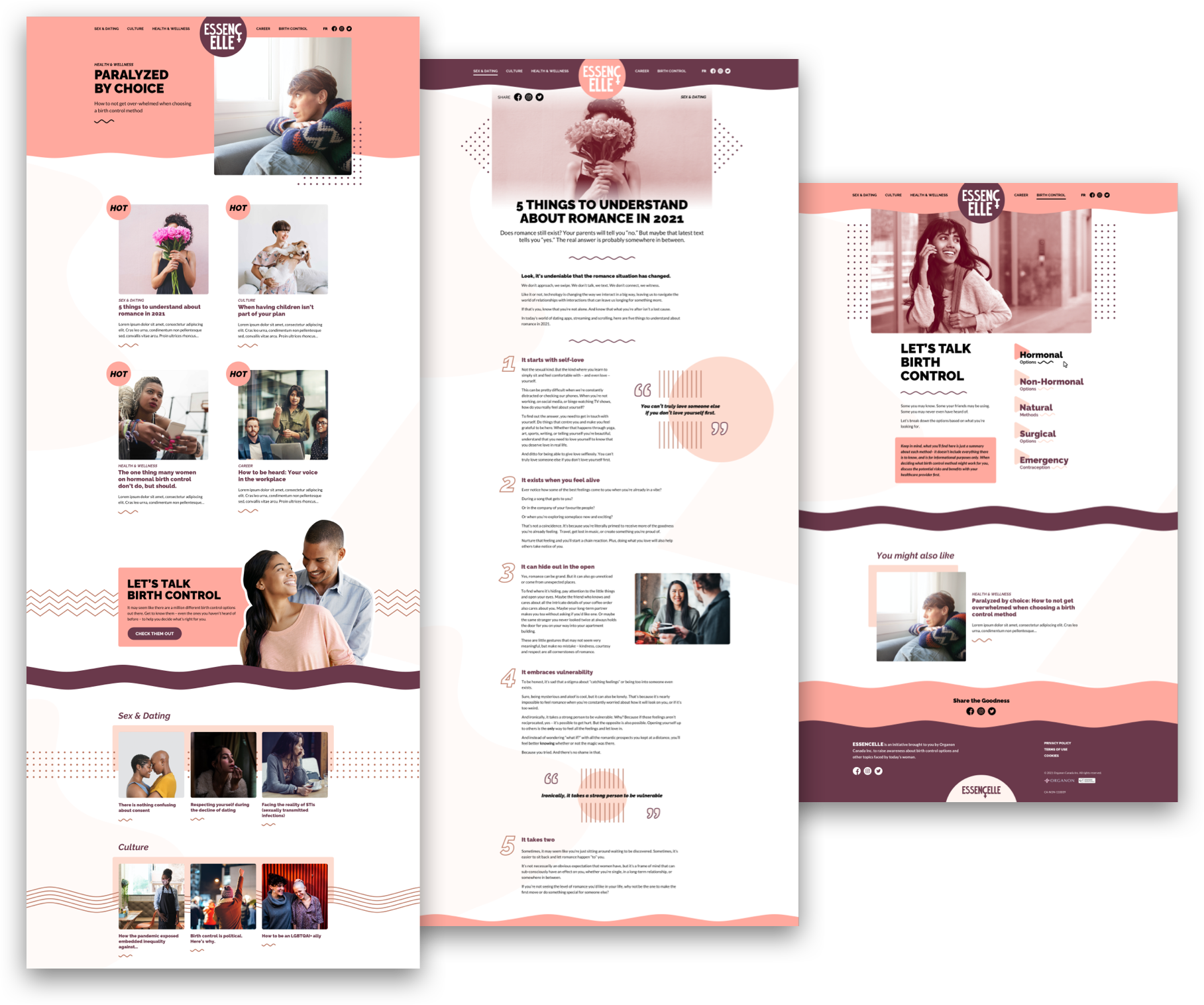
Commissioned by Organon Canada, Essencelle is a digital resource on women’s contraceptive options. It is, in addition, a hub for articles on topics about women’s health, sex and dating, career and workplace, as well as lifestyle and social justice.
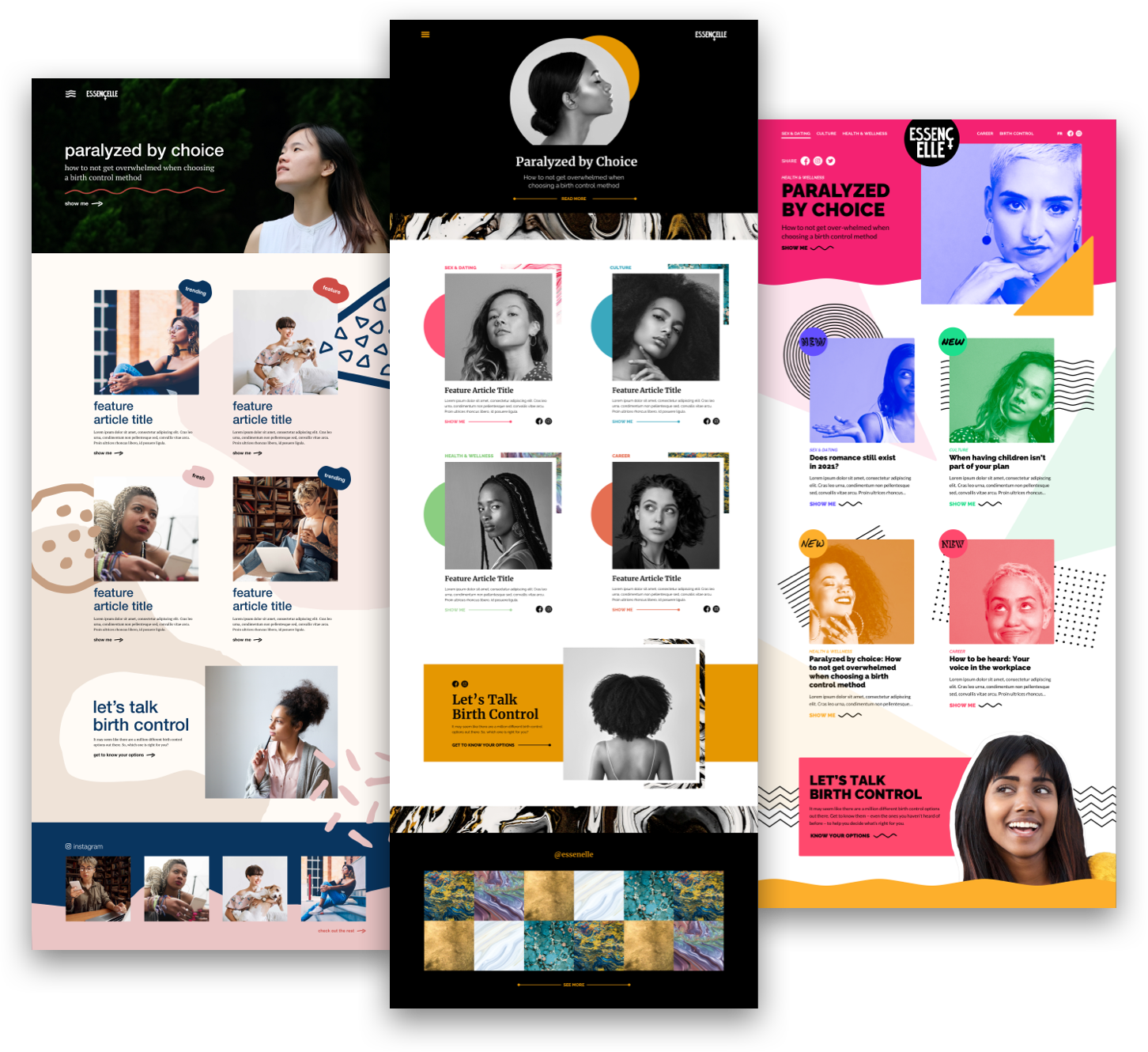
For the first round of design we provided three distinct homepage directions to the client. The first focused on neutral tones, organic shapes, casual photography and a low stakes typographic tone. The second took on inspiration from fashion, with mature strong contrasts, black and white imagery, serif titles, and a focus on marbled textures for supporting elements while colour was used in small bursts for emphasis. For the third, duotone imagery was paired with vibrant primary colours, vector patterns and simple shapes to create a more expressive look with multiple fonts differentiating each category of articles.
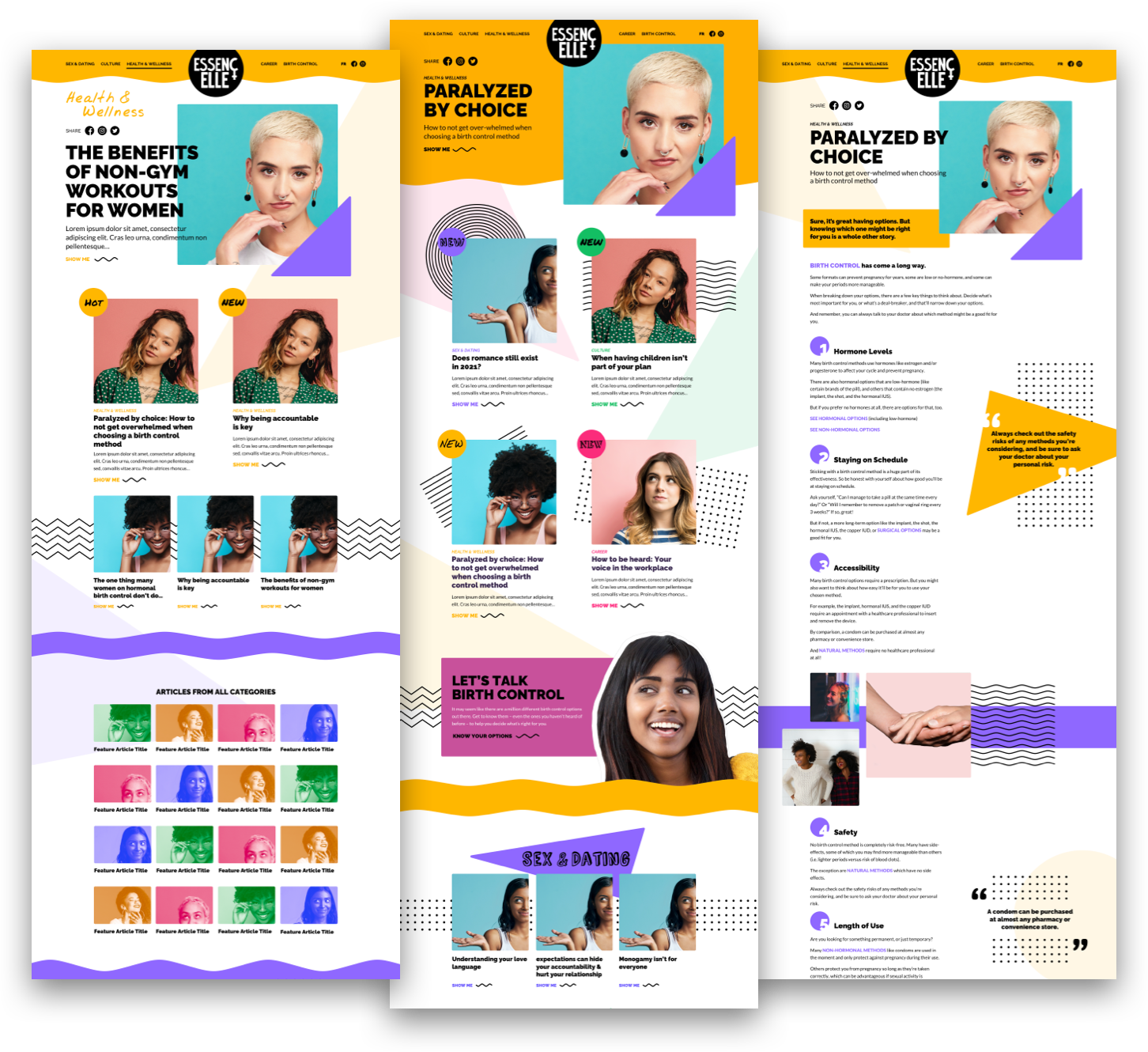
Moving forward with option three in the second round, we reigned in the loudness of the design by removing the duotones and shifting to a clamer yellow as our primary tone.
As the project progressed to its conclusion, the client took interest in a subdued scheme of salmon hues and a minimalist aesthetic, trading the sharp geometry and pop imagery in for the lighter organic shapes and casual photography of our first initial option.
- Second Round
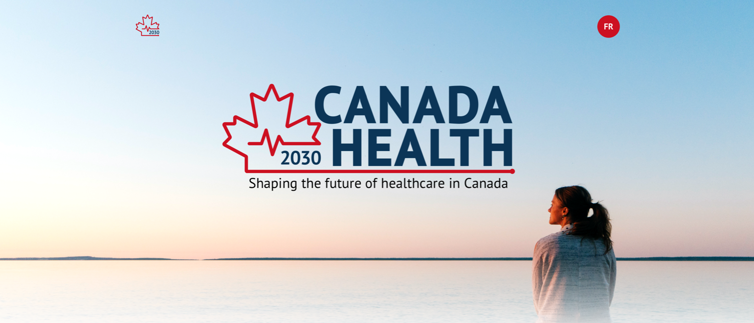
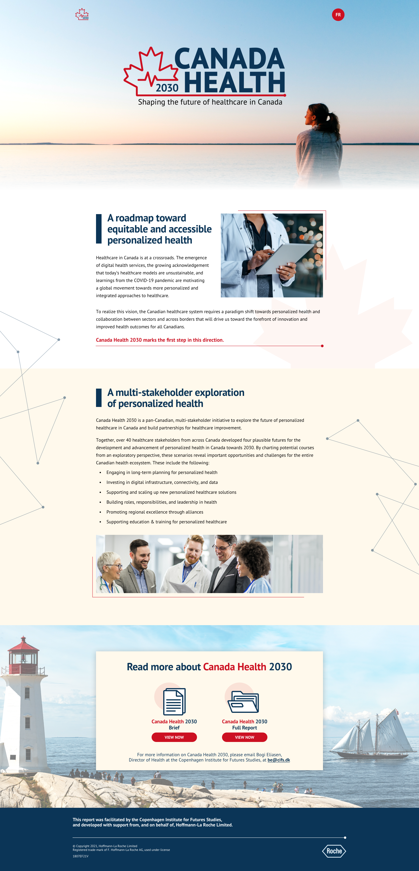
Canada Health 2030 Web Design
- Final Design & Wireframe
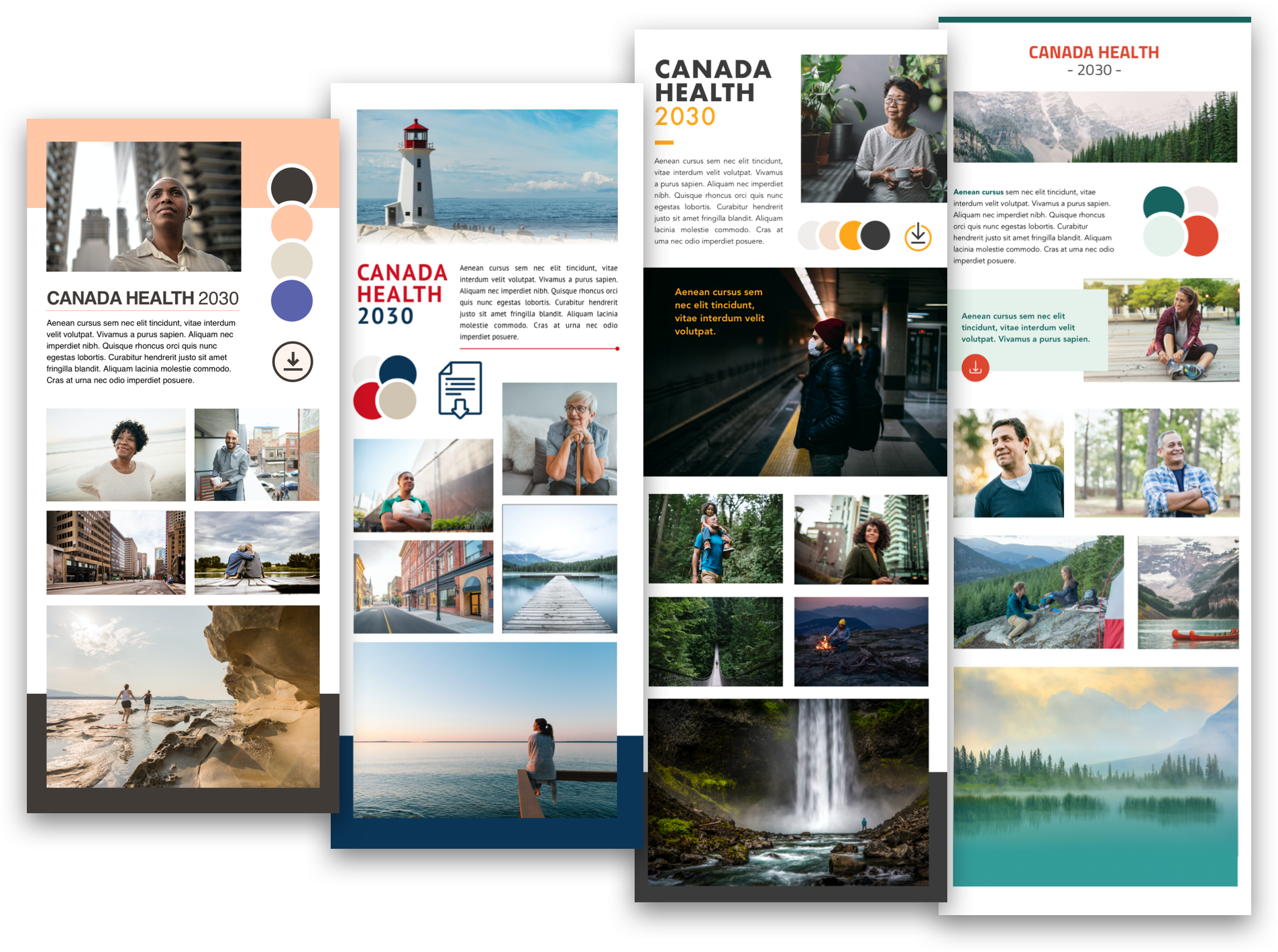
Facilitated by the Copenhagen Institute, Canada Health 2030 is an initiative that convened 50 stakeholders to discuss the future of health in Canada resulting in the creation of a 40 page report outlining predictions and concerns.
Our task was to make an approachable one page website to introduce and link out to the report as a support piece. In addition, we needed to establish a word mark and supporting design language for the report that would be maintained through future social media materials.
We started with two simple wireframe options and a series of mood boards to help establish the tone. In creating these I aimed to capture the imagery of Canada through different colour pallets and photographic moods. After their review the client went forward with the cool toned, east coast approach which was applied to the first moodboard option.
- Moodboards
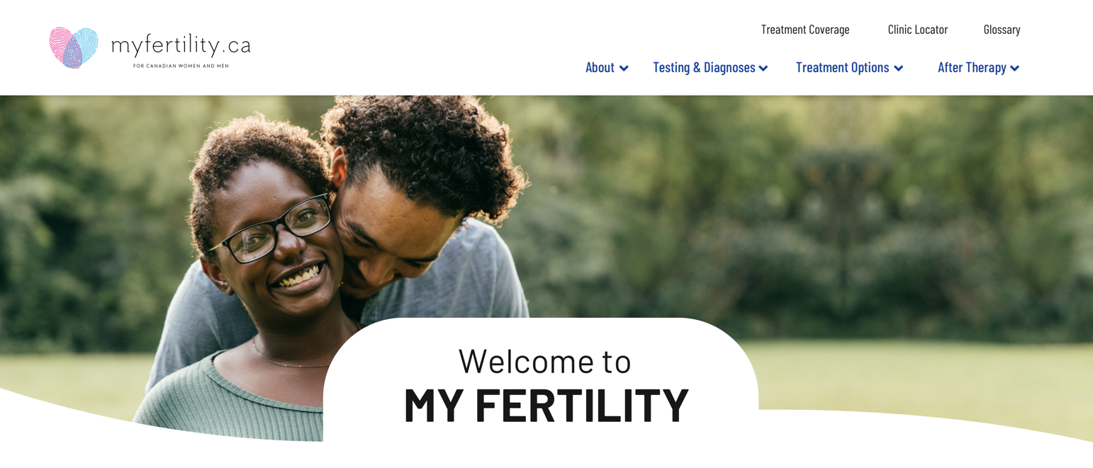
MyFertility Web Design
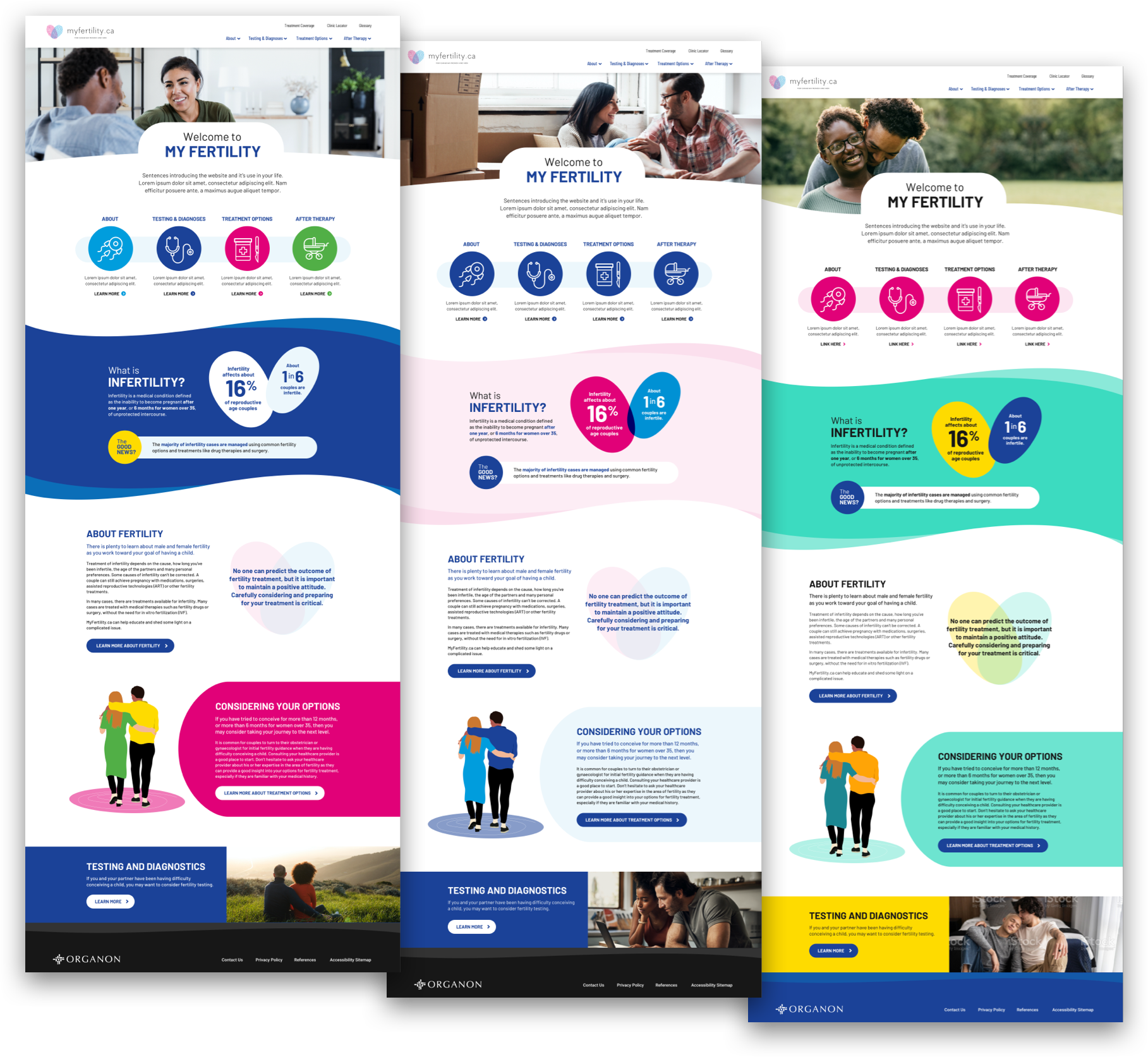
- Homepage Colour Options
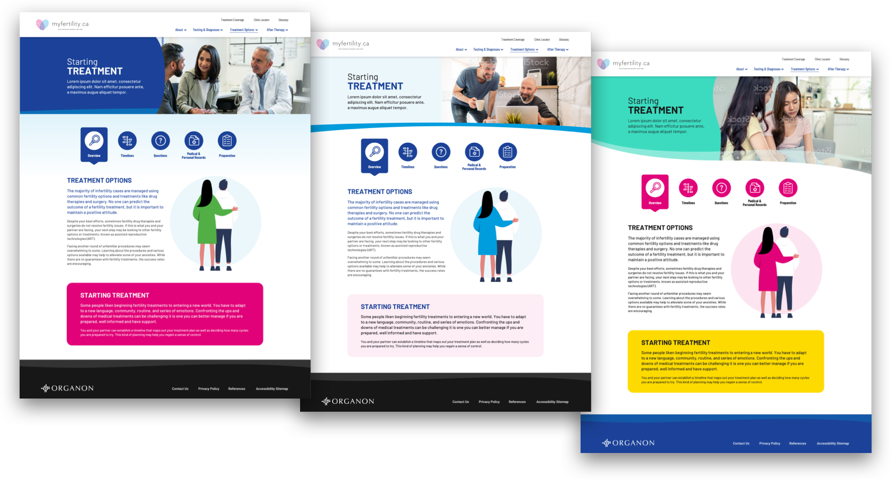
- Interior Page Colour Options
Part of the Organon Canada umbrella, MyFertility is a guide for couples experiencing difficulty with conception, outlining the step-by-step journey in testing for and treating infertility. Our primary task was to better align the pre-existing MyFertility website with Organon Canada’s updated branding while also adjusting a key UX issue of the interior pages.
In the original design each link within the top menu’s dropdowns contained an additional sub menu of links. Since much of the content of these subsequent links were quite brief and should be read linearly, we chose to condense them all into sections of a single page. However, to maintain the segmentation we designed several secondary navigation methods. These included a long scroll page with a hovering left hand sub menu for quick scrolling, a grid of cards that would each open to reveal content, and lastly a row of icon buttons to cycle through the page’s content.
Moving forward with this last navigation method, we approached the design with three different levels of adherence to the brand. Option one took a holistic approach with all the primary and secondary colours having a chance to shine while focusing on the primary blue and magenta. Option two utilised just these primaries at about 20-30% opacity with swashes of full saturation for emphasis. FInally, the third option focused on the underused secondaries and tertiaries to create a fresh but identifiably Organon piece.
MyFertility is currently in development.
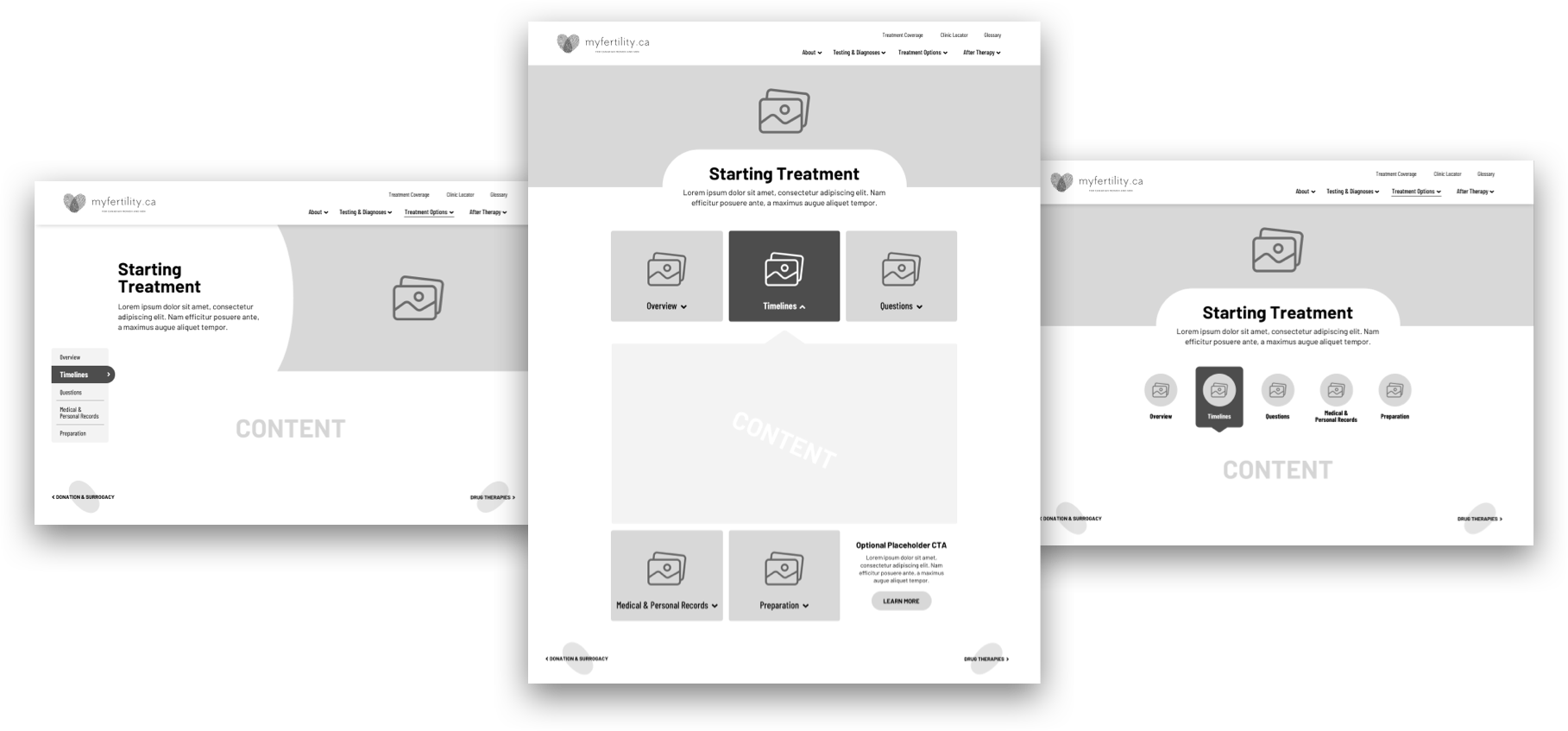
- Interior Page Wireframes
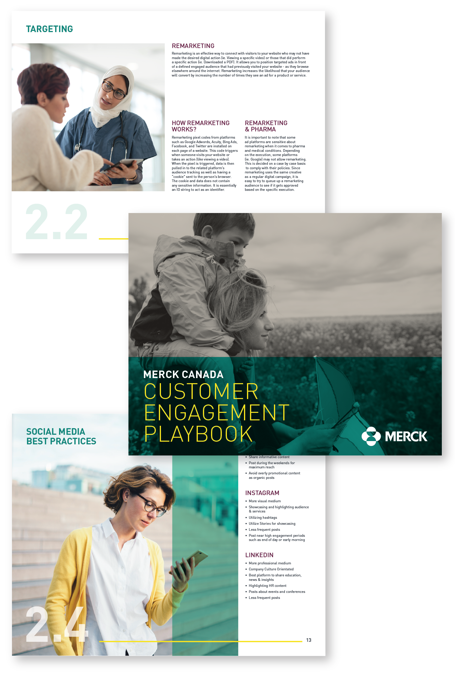
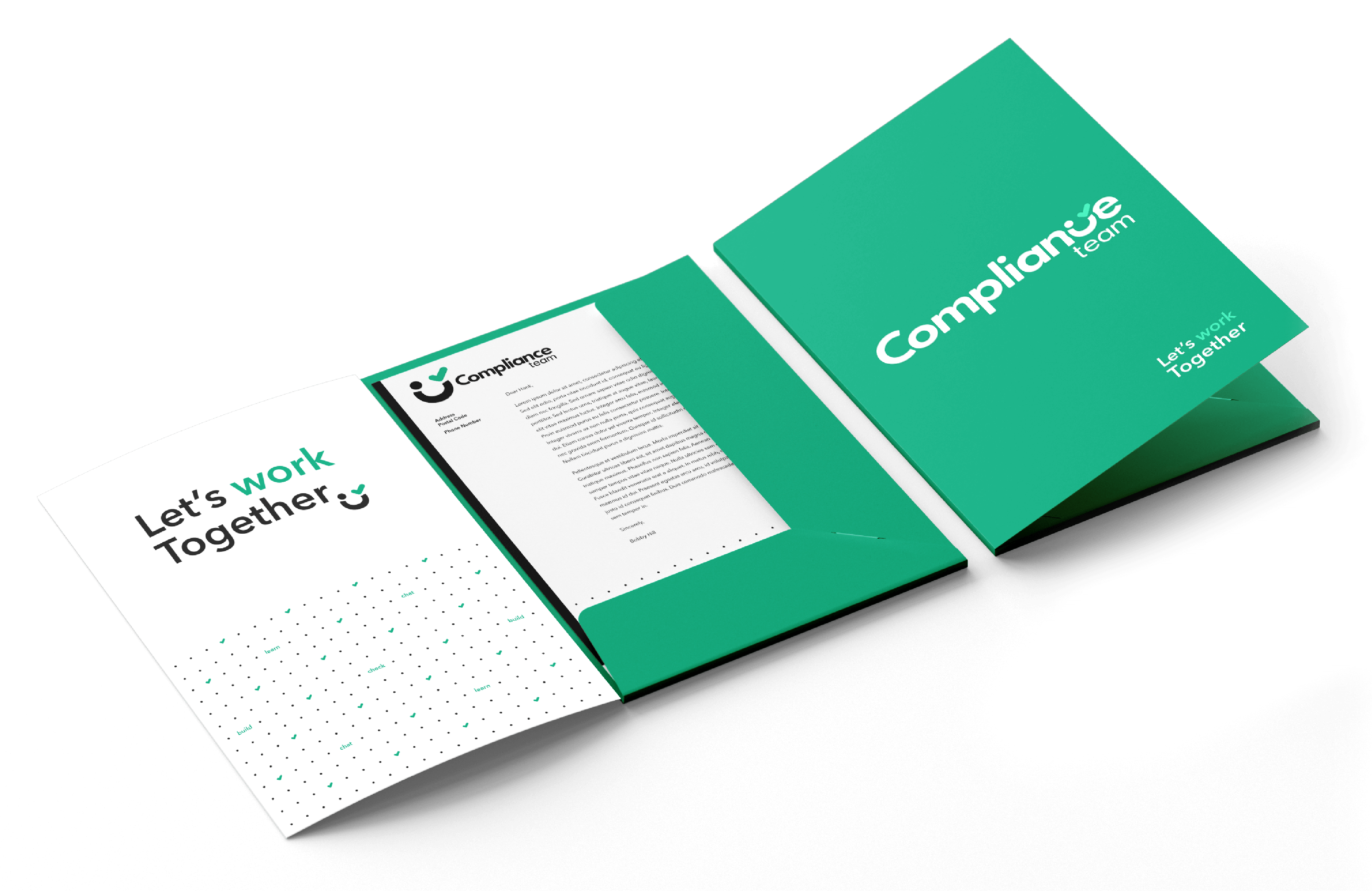
Compliance Team Branding | Print

An internal rebrand of Merck Canada’s Compliance Team, whose work entails reviewing and approving pharmaceutical copy work that is to be seen on products, marketing and web material. The need was for a friendly and approachable persona that could be condensed into a logo and then expanded to materials such as emails, wall decals and folders. Given the lighter restrictions and the small intimate scope the desired results felt attainable. We could afford to be more playful in how we portrayed the relationship between Compliance and the rest of the company. A perfect opportunity to reorient how employees engaged with the team and their processes.
We researched negative phrases and keywords that employees might associate with the Compliance Team in order to flip them on their head and use them as assets in defining the core message of the brand. Working from gut instinct I explored fun and playful ideas to produce concepts that felt cheeky and engaging. These included turning common rejections into characters, blowing the whistle on errors, and even utilizing the word “No” as the bold core element. Much fine tuning was required to achieve the desired results.
The concept I arrived at was about the journey from revision to approval. With the dotted eye representing an edit and the checked wink representing approval, these elements are tied into the C to complete the new face of the Compliance Team. A friend who has your success in mind and will always say yes... eventually.
Jolly Snacks Branding | Web Design
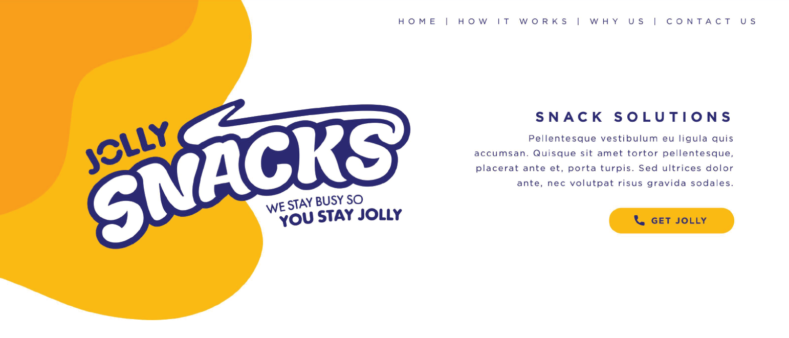
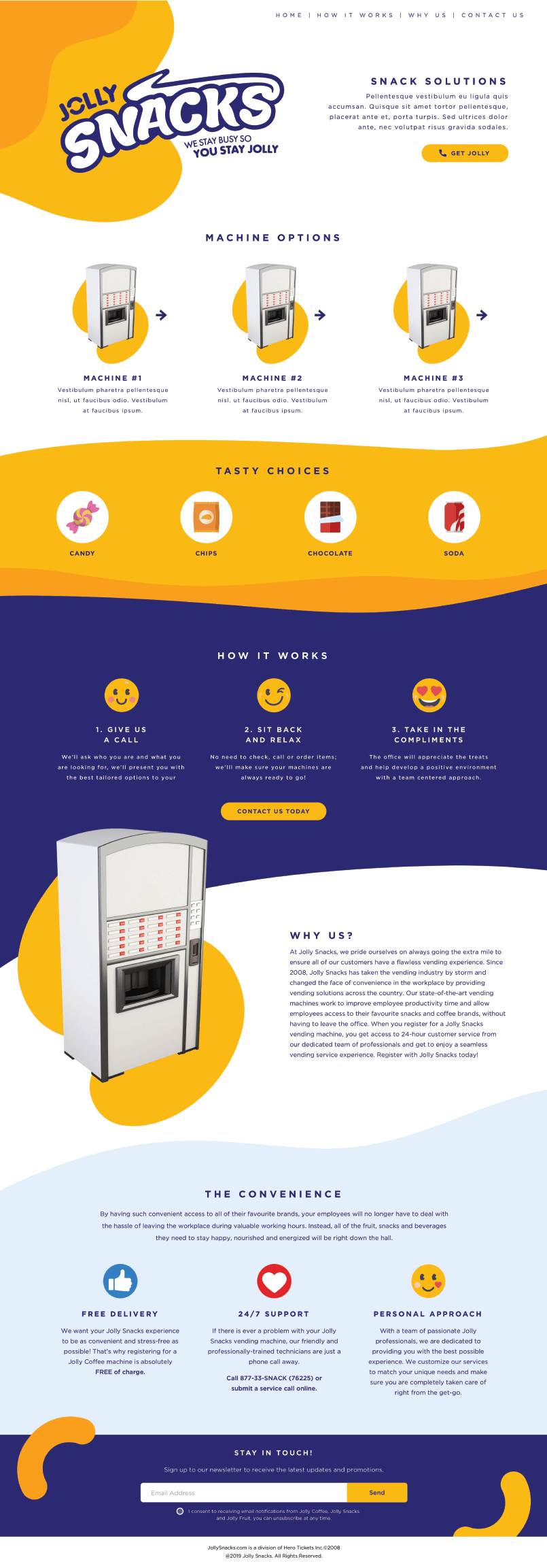
A rebrand of Jolly Snacks. Create a logo that could be modified for three different branches of the Jolly Snacks company and could be applied to vending machines. A website for each of the three branches would also be created. As the scope was small and concise our solution could be tailor made to the client.
My research was focused on how candy logos utilize depth, curvature, colour and imagery to stand out and grab attention. I used accounts of personal tastes to pinpoint which brands people preferred and the visual flavours they represented. Utilizing the basefont Lemon I produced an iterative series of experiments to try and reproduce these key elements. Based on my research the logo had to reach a certain level of bubbliness within a complimenting border to match the level of design seen elsewhere. This was also used to help provide visibility on all background types.
In the final logo I aimed for a more neutral taste, using navy blue complements the brands within the theoretical vending machines allowing them to stand out. Orange was brought in as the supporting colour to contrast and energize the logo in more focused circumstances. In rebranding the existing UX framework I removed the rigid boundaries between sections and expanded upon the final logo to provide the front end with a flowing form in sync with the logo’s core elements. The mockup seen represents an early stage with placeholder text and images filling in for future content.
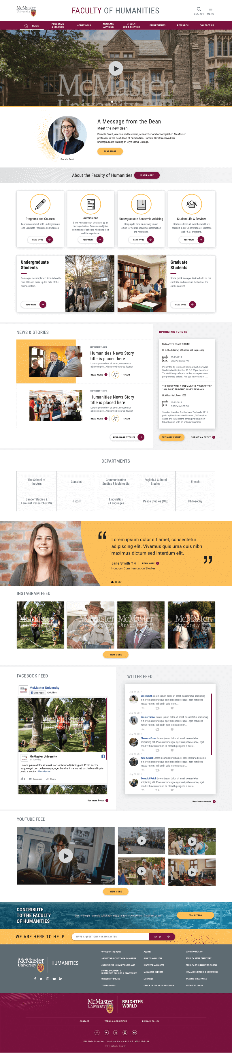
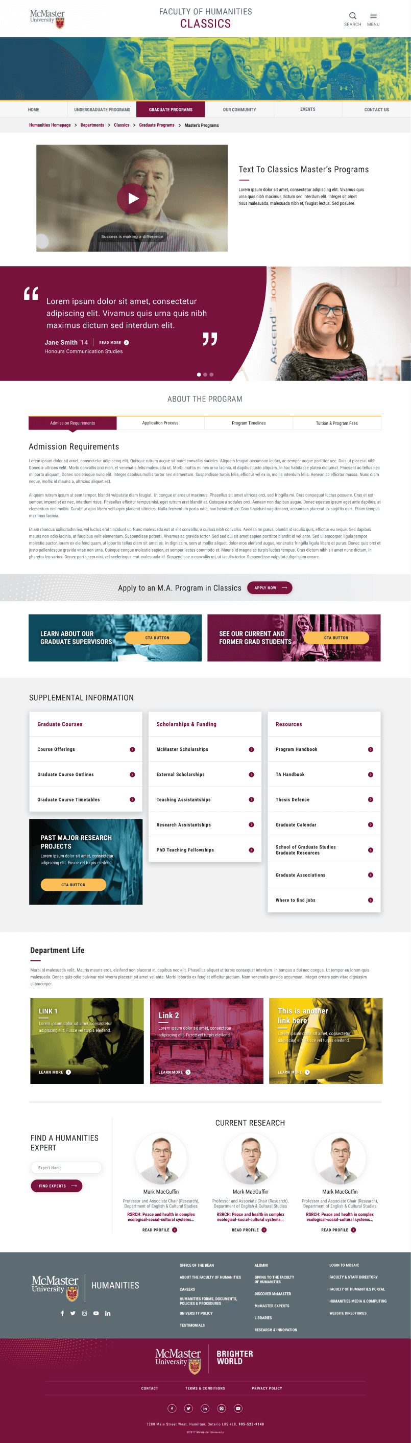
McMaster - Humanities Web Design | User Interface | User Experience
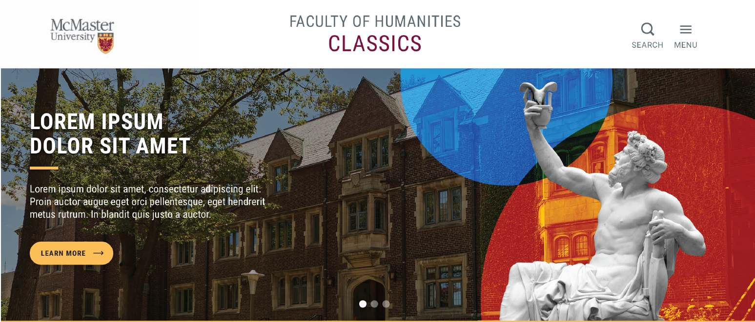
A redesign of McMaster University’s Faculty of Humanities website and subsidiary microsites. Built on the updated McMaster Brand Guidelines the website would utilize new information architecture and a modular UI system to reorganize and reduce bloat in over 200 pages. Since the majority of content would be assembled via the modular UI system it would be key to design for all potential types of content in a multitude of stylistic and functional variations. Thorough planning, research and foresight would be critical as the UX and site architecture must resolve key issues present in the original website.
To determine the requirements of our information architecture and types of UI modules, we regularly inquired with staff to better understand what drives their decisions. In doing so we often learned they needed far more than they may have let on and that their needs would regularly expand. In addition we spent our time researching how other institutions dealt with similar UX situations to learn and apply as seen in sections such as Course Outlines.
Designing page layouts required many levels of review and approval. Revisions for one page could have ramifications for another and required thorough understanding of the site architecture and systems to accommodate changes. A resourceful head was required as new solutions were needed on a regular basis to prevent the user experience from becoming overcrowded and losing focus. To accommodate the high number of CTAs and density of information we provided all modules with a high level of breathability through whitespace.
McMaster Humanities is currently in development.